Omnichannel UX/UI
Nike Tmall 618 Experience Refresh
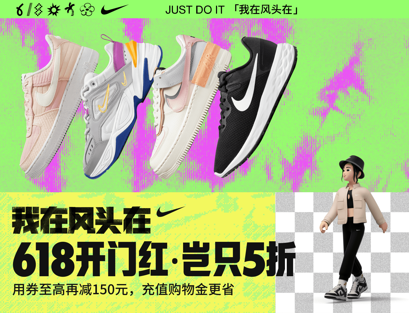
This was Nike's primary digital campaign for the 2022 618 promotion. The task was to redesign the Tmall flagship homepage so it could better convert traffic during the peak sales period.
Strategic Question
Balancing personalization with product discovery and member visibility.
Outcome
A modular homepage system that adapts product, membership and campaign content to distinct audience needs.
Impact
A clearer path from campaign arrival to product discovery and purchase decisions.
Design Challenges
Membership value was not visible enough
Member benefits and priority messages needed stronger placement without disrupting product browsing.
Product discovery had to adapt to different users
The homepage needed modular content that could respond to different scenarios, interests, and campaign priorities.
Campaign energy needed a clearer shopping path
Visual impact had to support, not compete with, product understanding and purchase journey decisions.
Design Approach
The project followed an iterative process from research and problem framing to interface design and validation.
Week 1
Week 2-3
Week 4-5
Week 6-9
Brief / Reports /
Competitive Audit / Data
Consumer persona
Points of difference; theme of
engagement; content inspiration
Persona strategy
Consumer journey flow
Innovation content
Alignment & Confirmation
Wireframes designed by Figma
Discuss and guide feasibility with visual designers
Keep upgrading modules on different phases
Launch the page on every phase,
and assist with continuous updates
Solutions
Persona-Driven Structure
User groups were segmented using client data, with clear sales targets defined for each. Personas were profiled by interests, behaviors, and usage scenarios to guide targeted design decisions.
Information Integration
Interactive and dynamic modules were introduced to communicate membership benefits more efficiently, reducing visual clutter and maximizing page space.
New Module Design
Leveraging product-specific sales goals, multiple interaction patterns were explored to align with consumer behavior, resulting in modules that delivered a fresh experience and differed significantly from previous campaign executions.
Persona Definition
User groups were segmented using Nike’s internal consumer data combined with strategic analysis from the planning team, with clear sales objectives defined for each segment. Personas were profiled by:
Female
Male
HH Driven
MD Driven
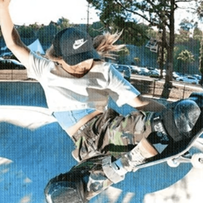
It Girls
- High spending
- Trend-setters
- Visual driven
- New & socially trendy
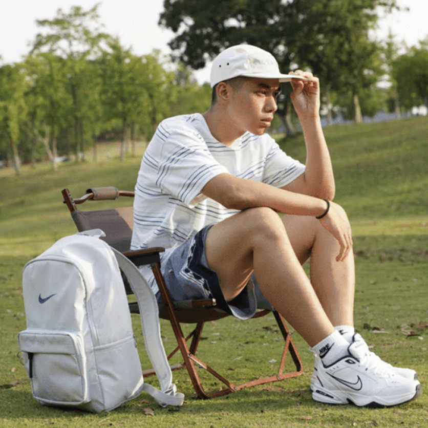
Sneakerheads
- High spending/repeat
- Big fans
- Geek & fanatic
- New & advanced
- Also attracted by MDs

Well-Thoughts
- Low spending Gen Z / repeat & others
- Discounts first
- Visual driven
- Purchase for kids/family members

Amateur Players
- Low spending Gen Z or new others
- Discounts first
- High price value
- Function driven
- Easy Navigated
* HH, High Heat products. MD, Mark Down products.
Personalization Logic
The homepage strategy translated audience differences into modular rules for product emphasis, promotional messaging and UX content. Rather than designing one universal shopping path, the page system adapted what each group saw first, how products were grouped, and which cues helped them move from browsing to purchase.
Amateur Players

Footwear, function and clear comparison.
During the sales period, this group cared more about shoe categories, functional product benefits and clearly separated shelves. The homepage therefore prioritised structured product blocks, direct benefit copy and easier comparison between options.
FEMALE / Well-Thoughts

Outfit styling, social proof and assisted purchase.
This group responded more strongly to full-look styling and UGC-style cues that created recognition and confidence. Comment-stream interactions supported social validation, while male and kids’ sections were surfaced because these shoppers often buy for partners, family members or children.
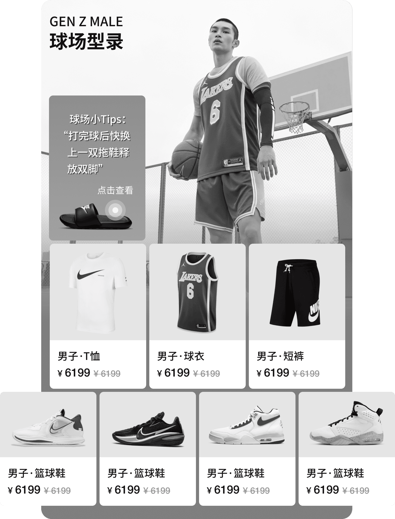
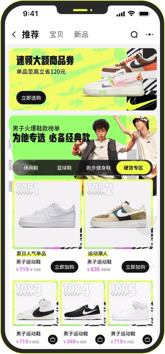
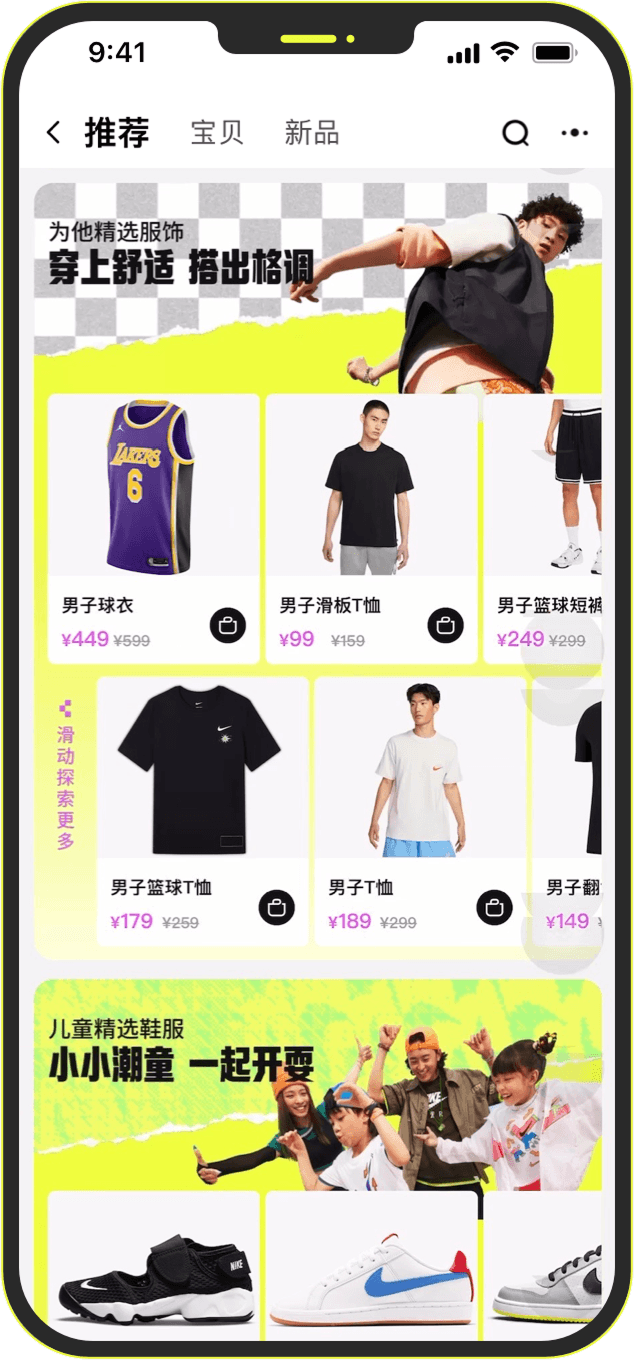
MALE / Sneakerheads

Sport scenes and identity-led discovery.
For styling-oriented male audiences, products were easier to frame through active scenarios such as basketball or football. Scene-based product grouping helped connect Nike’s performance image with everyday styling and purchase intent.
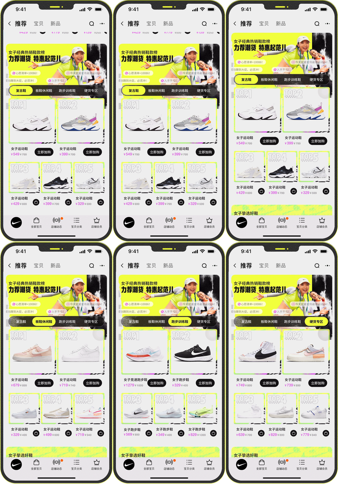
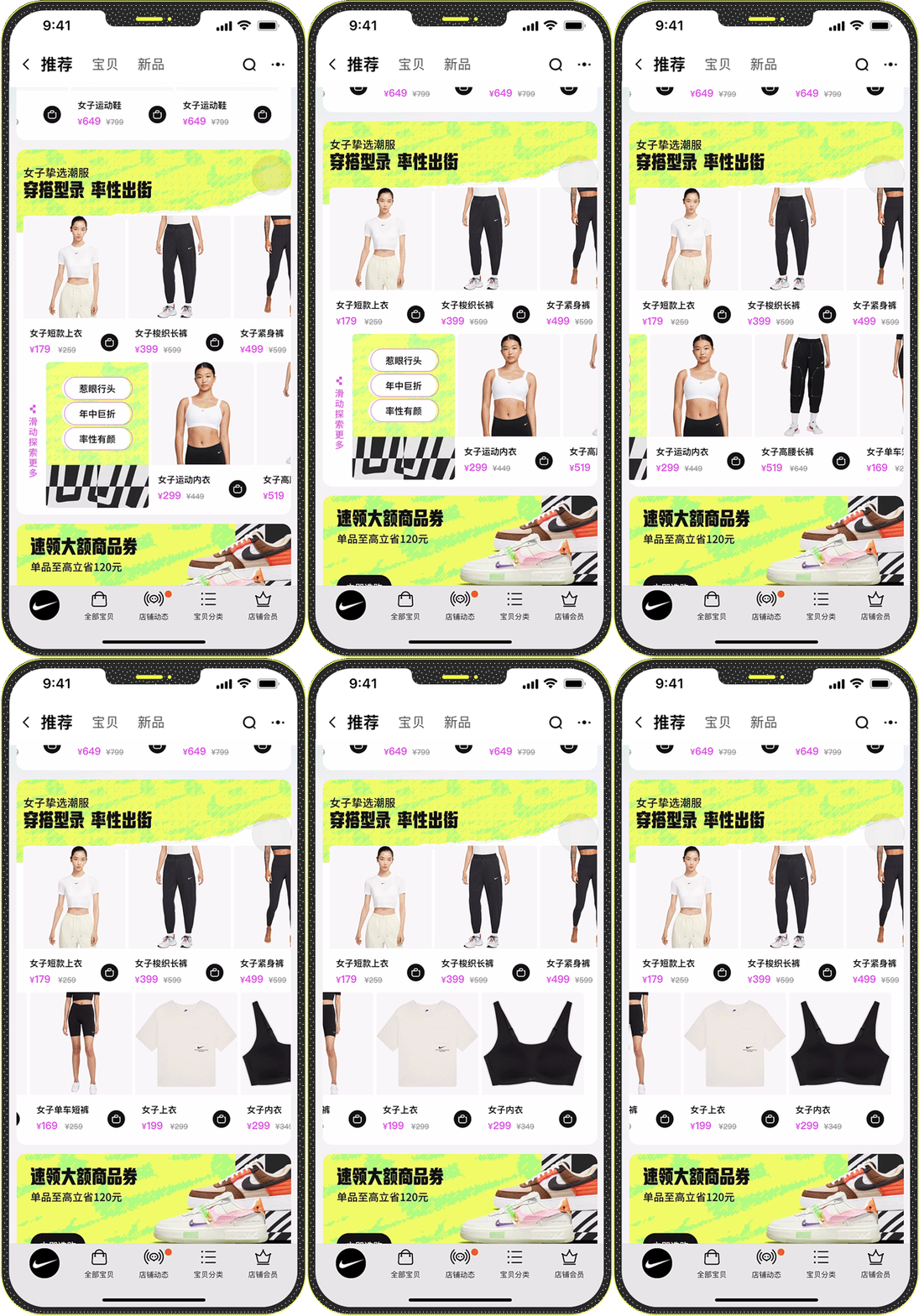
FEMALE / It Girls

Colour, styling combinations and visual browsing.
For It Girls, the experience leaned into colour coordination, expressive campaign visuals and trend-led product choices. The following journey uses this segment as the detailed example for how persona logic shaped flow, module hierarchy and UX content.
Consumer Journey
The consumer journey was reconstructed based on the optimized flagship-store homepage, mapping how users progress through key touchpoints—from arrival to exploration, product discovery, and conversion. The updated flow highlights improved benefit visibility, clearer product prioritization, and more engaging interaction cues that guide users efficiently toward purchase.
* From Consumer Journey onward, It Girls is used as the detailed example to show how one segment’s motivations were translated into page flow, module hierarchy and UX content.

Wireframes
Low-fidelity wireframes outlined page structure, module logic, and interaction flow, serving as a blueprint for cross-team alignment with strategy, creative, and client stakeholders.
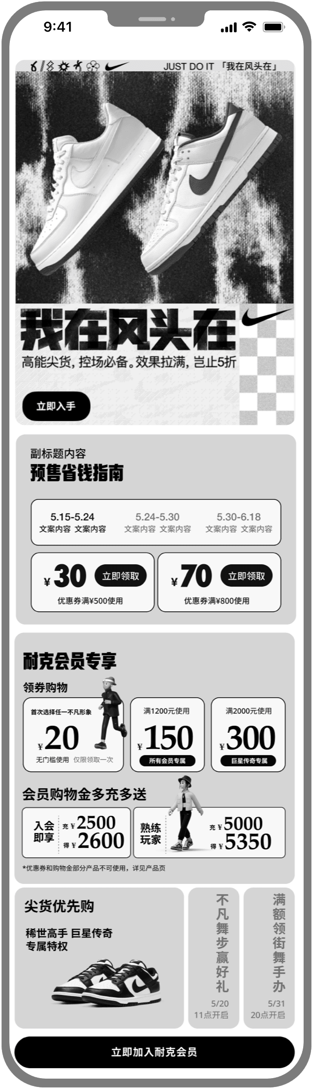
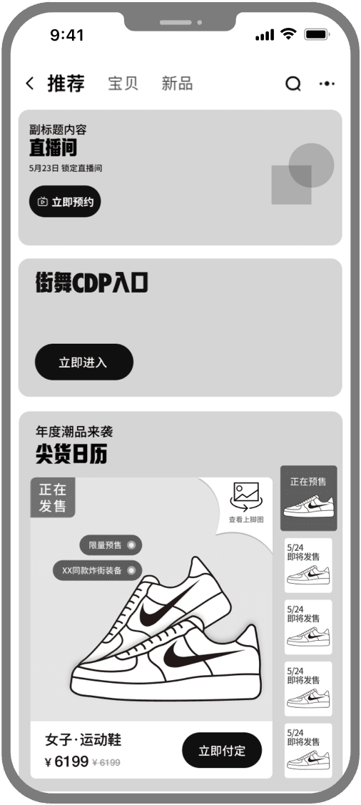
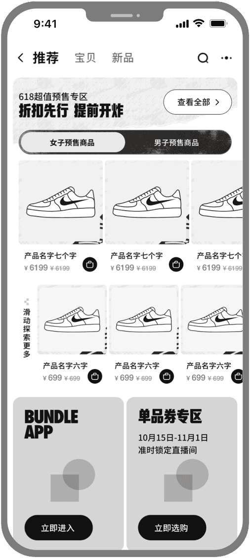
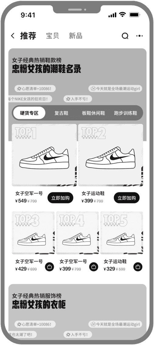
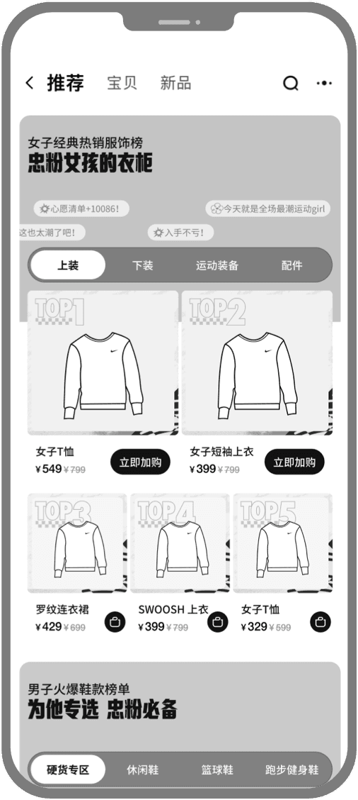
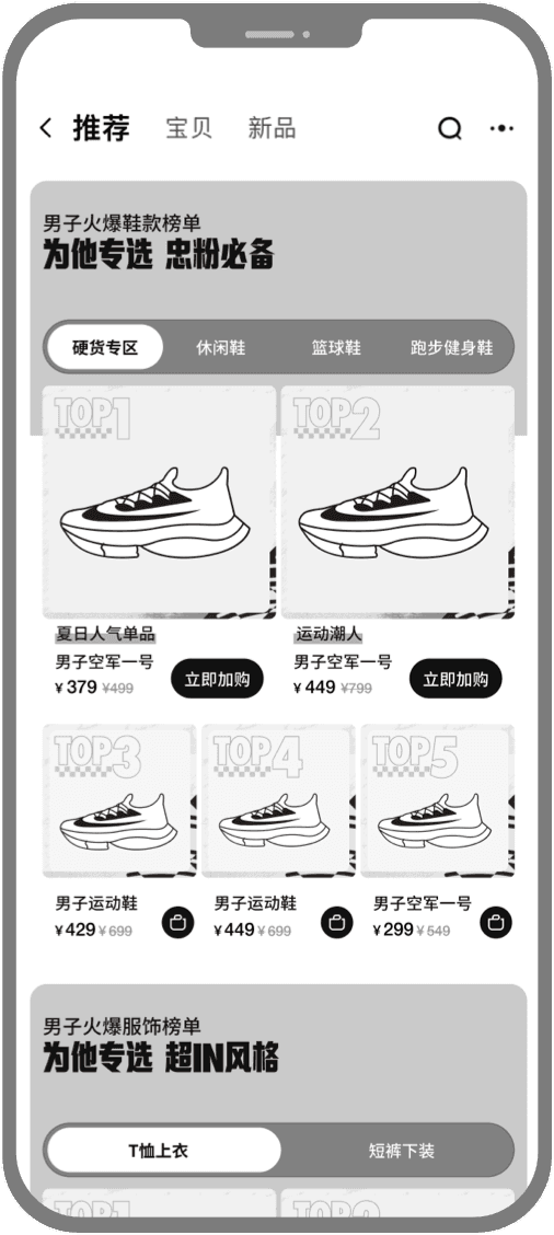
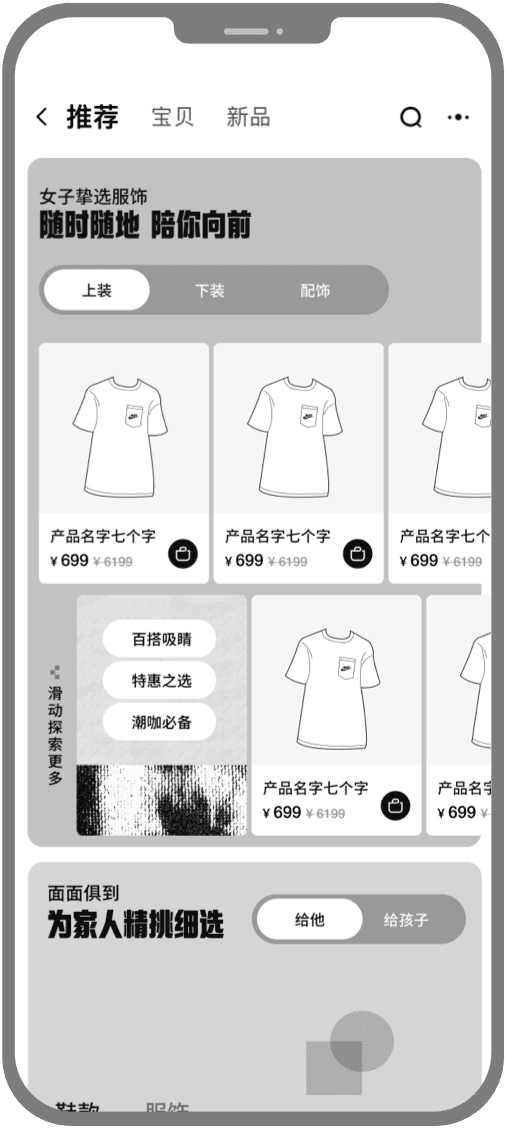
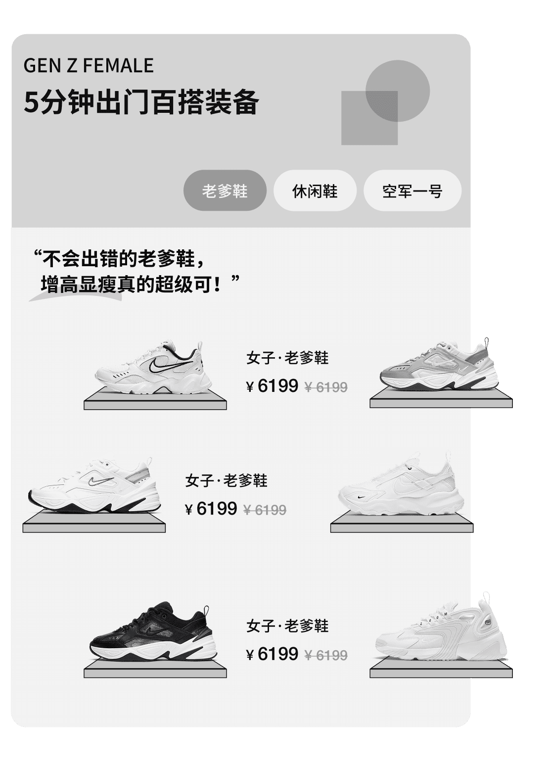
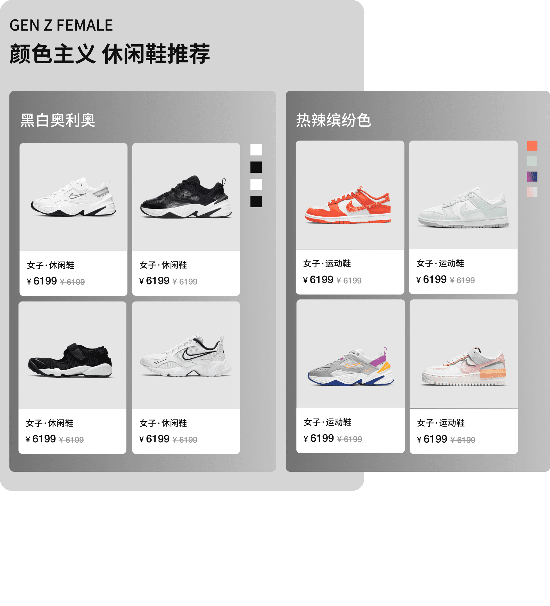
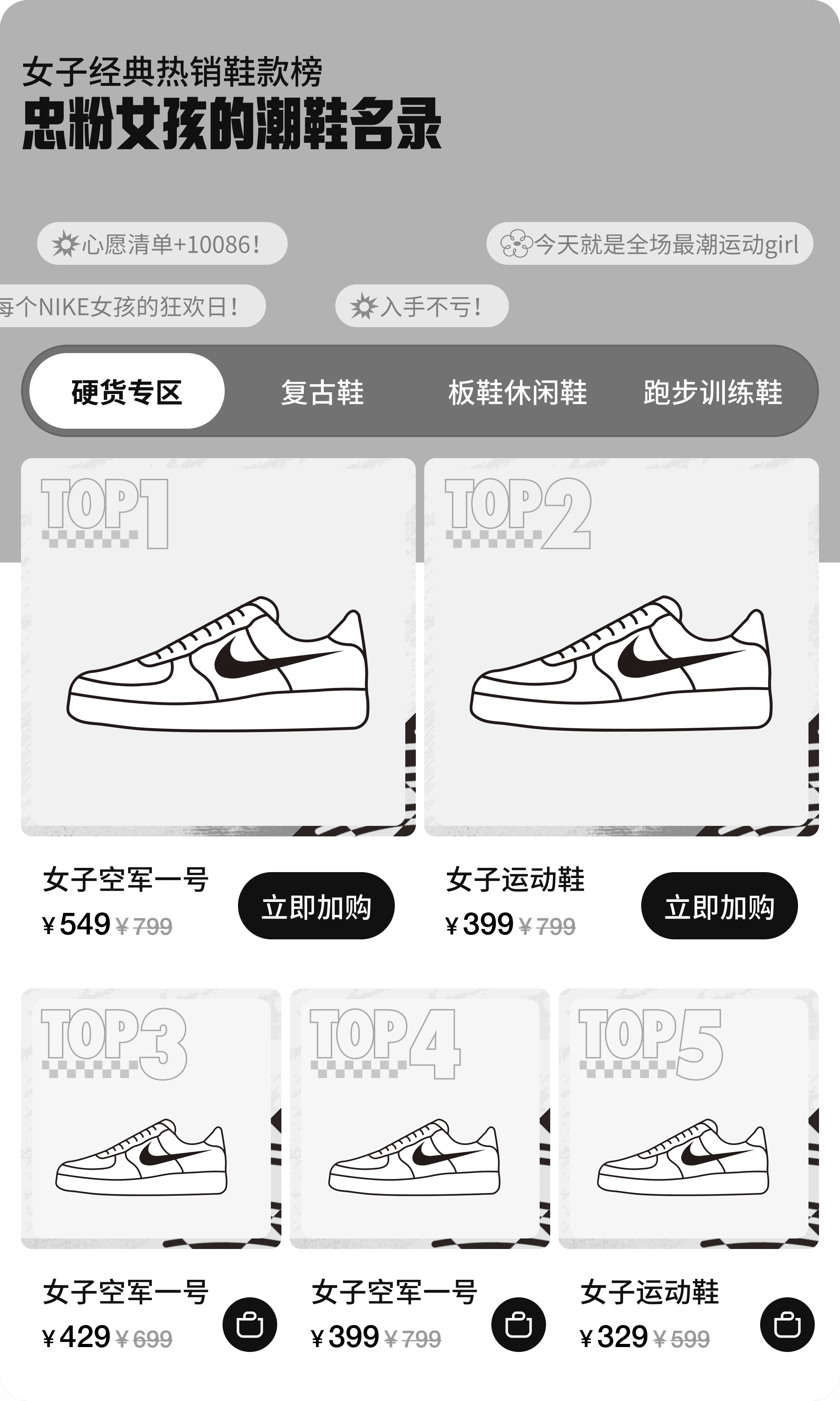
Key pages, components and interactive modules.
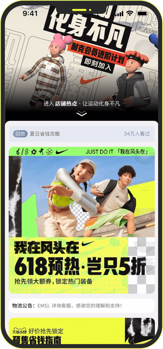
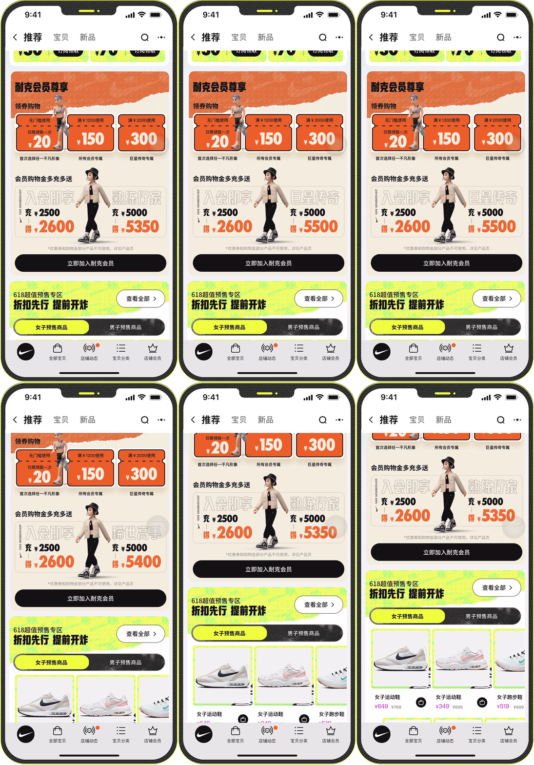
The final homepage presented a visually cohesive, high-impact layout that combined dynamic membership modules, clear product prioritization, and innovative interaction flows tailored to user behavior. Execution focused on building flexible content blocks, promotional modules and experience details that could support both brand expression and e-commerce performance, while adapting offers, product emphasis and UX content to different consumer segments.
Key Takeaways
The final homepage presented a visually cohesive, high-impact layout that combined dynamic membership modules, clear product prioritization, and innovative interaction flows tailored to user behavior.
Communicate Early and Thoroughly
Strong communication with both clients and internal teams at the start of a project is critical. Asking the right questions early prevents wasted time, uncovers missing information, and accelerates insight generation.
Partner Closely with Strategy
Deep collaboration between UX and strategy strengthens our understanding of target groups, brings in multiple viewpoints, and ensures strategic thinking translates clearly into design decisions.
Design Beyond Constraints
Even with limitations, it’s essential to explore multiple design directions. By shaping modules that best fit existing content while introducing new interaction ideas, we can deliver fresher experiences and support stronger commercial outcomes.
Provide Clear, End-to-End Guidance
UX should set precise guidelines for related teams — covering module behavior, dynamic rules, and copy tone. Thoughtful planning up front enables smoother downstream execution and keeps the overall experience consistent.